R/GA
Verbal Designer
March 2020 - May 2022
While at R/GA, I worked alongside everyone from Junior Copywriters to International Design and Creative Directors. Together, we worked with Google Play, Amazon Prime Video, RaceTrac, Dunkin Donuts and more.
I helped build full brand systems and style guides for organizations like Fortune 1000 Company Cigna, as well football league The XFL, most recently bought by international businesswoman Dany Garcia and highest paid entertainer in Hollywood, Dwayne “The Rock” Johnson. (More examples upon request.)
The XFL
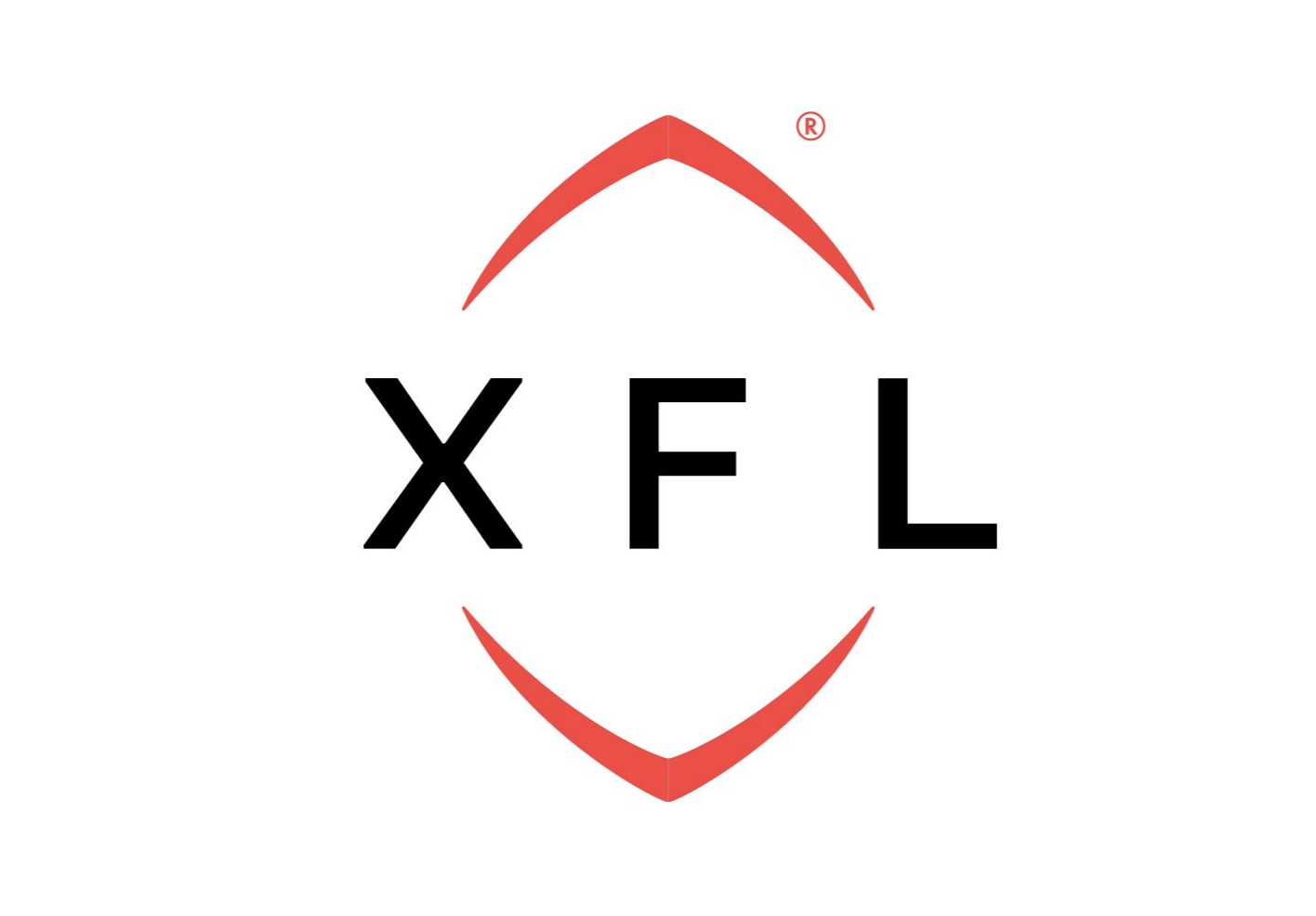
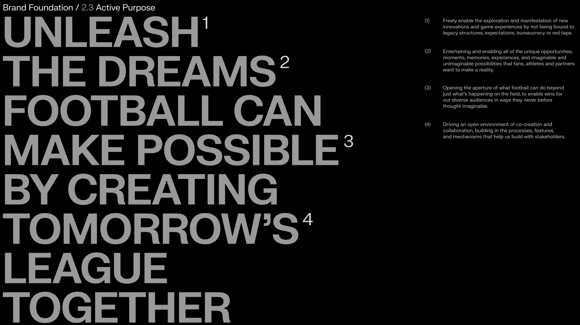
Creating Tomorrow’s League

The final logo after months of work. Its round interior corners and sleek sharp edges make it feel modern. The space in the center is a tangible representation of the idea at the heart of The XFL: it’s an intersection of opportunity.
HOW IT STARTED
Bound by a vision of longevity, Dwayne “The Rock” Johnson, Dany Garcia, and Gerry Cardinale’s Red Bird Capital bought the twice-failed football league, The XFL.
Ready to transform football, the team approached RGA for a logo. They wanted something different. Something that signifies a league of culture. A league open to co-creation, designed to inspire, and built for new opportunity. A logo that feels modern, timeless, and inclusive of all people—football fan or not.
As expert marketeers, we knew a logo without a brand would fall flat. After all, a logo is a symbol. A representation of the whole. A metaphor of brand values and spirit.
To get this right, we’d have to design more than a logo. We’d have to design a brand. And we’d have to build a football league.
So we built The XFL.


THE BRAINSTORM
& THE PITCH
FROM LIMITLESS DIRECTIONS
Using their logo descriptions as our ways in, we spent a week coming up with hundreds of possible brand directions. We landed on three.
TO THREE
01 Intersection of Opportunity
A brand identity built around The XFL being a crossroads of culture. A league where individuals are encouraged, ideas supported, and new opportunities are forged.


02 Spark of Dreams
A brand identity designed to inspire . Because only through co-creation—through encouragement, support and resources—can a simple spark become a dream realized.
03 Open to All
A brand identity created for inclusivity. To project The XFL as a league built for every person—football fan or not. And a league ready to do what it must to open doors of new opportunity for all.


We pitched directly to Dwayne “The Rock” Johnson (DJ), Dany Garcia and Gerry Cardinale.


They loved direction of number one: Intersection of Opportunity.

That the X represents the intersection of opportunity is REALLY powerful. The thing that’s most important is the story behind it and the story your building is truly spectacular.
- Dwayne “The Rock” Johnson, XFL Owner

“You nailed it. Absolutely nailed it. I just sent a woman dancing in an aisle saying "hallelujah" to DJ because this is EXACTLY what's needed.”
- Dany Garcia, XFL Owner, Businesswoman
BUILDING TOMORROW’S LEAGUE
With our direction chosen, it was time to build. The Verbal and Graphics team dug into the metaphor of intersection of opportunity to build a comprehensive brand system we could ultimately hand off to the marketing team at The XFL.

We began by refining The XFL’s purpose; creating a purpose, value proposition, and belief statement all powerful enough to hold a comprehensive design system on its shoulders.


The Verbal Design Director and I then started chiseling away at the manifesto. We passed it back and forth, iteration after iteration, until finally creating something that captured the spirit of The XFL.
We landed on a writing goal, something that encapsulates the collective impact we want our communication to convey. We created questions to guide writer during and after media creation to ensure they were on brand.


Touch point after touch point, we created watch outs, rules, examples, do’s and don’ts. We crafted a voice built for a league of opportunity.
Along the way, as lines came to us, like “Tomorrow’s League” (a line I had come up with early on in the process), we wrote them down in case they aligned with what we were creating later on.

RESULTS
1 comprehensive verbal and visual brand identity
222 page brand system Style Guide delivered

The Wrap Up
When all was said and done, we had ourselves a football league to be proud of.
We created an identity that captures a league of culture. We created an identity that spurs from the intersection of opportunity, one that brings people together through ideals co-creation and inclusivity.
It’s a league designed to inspire and a league set to launch in Spring of 2023.
We created The XFL.
Cigna: Evernorth


Cigna wanted to launch a health services company that could stand as an independent brand.
Enter Evernorth—a multi-billion dollar health services company complete with its own name, personality, and verbal and visual design brand playbook.


After weeks of creative brainstorming and building out 3 prospective brand paths, we’d finally landed on a name and purpose to live as the foundation of our design system:
Evernorth
Elevating health for all through the power of the collective.
No matter what.
When branding, it’s important to understand that a name is more than just a name. The name Evernorth captures the spirit and far reaching aspirations of the overall brand to elevate health. The word “ever” suggest continuity, while “north” implies upward movement.
With that felt bold, but uplifting and light, it was now time to build the brand system, capturing this same essence within the brand character, tone-of-voice, brand voice and design principles, writing considerations, annotated examples, writing checklist, style guide and more.


I collaborated closely with the Group Creative Director and Visual Designers. We built out multiple physical and digital touch points including an introduction pamphlet, a prospective weekly newsletter, business cards, OOH billboards and newspaper print ads (as seen above), office designs, and then some.


For Evernorth featured in Bloomberg
CLICK HERE
For Evernorth featured in Healthcare Finance
CLICK HERE
Cigna: Evernorth
Illustration System

THE BRIEF
Months after the initial ask was delivered, Cigna asked R/GA to design an illustration system for Evernorth.
Having built the brand, as well as having an understanding of design, I was tapped as lead Verbal Designer to collaborate with the Group Creative Director and Design Team.


We brainstormed and refined our concepts for weeks, finally arriving at an illustration concept that seemed to hit on the points in the brief, while capturing the essence of Evernorth. Below are some images of the final deliverable, with design principles and concepts translated by me.


Full 50-page Evernorth style guide illustration addendum can be seen upon request.
Void: TakeYours
Void, an agency that specializes in creating brands for athletes and influencers, approached R/GA. They wanted help developing 5 different talent partners and brand ideas, all of which they had products for except 1: fitness.
With that, I was paired with a Graphic Designer and together we picked the fitness brand, the least developed of the ideas.
The ask:
“Build the next fitness franchise,” with their talent partner Saquon Barkley, the New York Giants running back known for his massive quads.


With Saquon as the talent partner, we knew the fitness product would have to be leg oriented, but what that meant we were unsure. We began deep-dive research on Saquon Barkley. Interviews, podcasts, highlight clips, Wikipedia pages (which eventually led to understanding his background and family), and more. Based on my research I gathered a few interesting insights about Saquon:
He is very motivated, swearing by the use of affirmations and visualizations
Growing up he always had to prove to others that he was worthy of being where he was
He says he always focuses on whats in front of him, taking everything one day at a time

Applying these insights, I started brainstorming different possible names and products for a fitness franchise owned by Saquon Barkley. For a product, we landed on a smart plyometric box that could help a user perfect their technique and train like Saquon. For a brand names, we landed on two: RiseUp and TakeYours
My graphic design partner and I explored both brand avenues.


We presented and pitched both to company stakeholders. We landed on TakeYours.
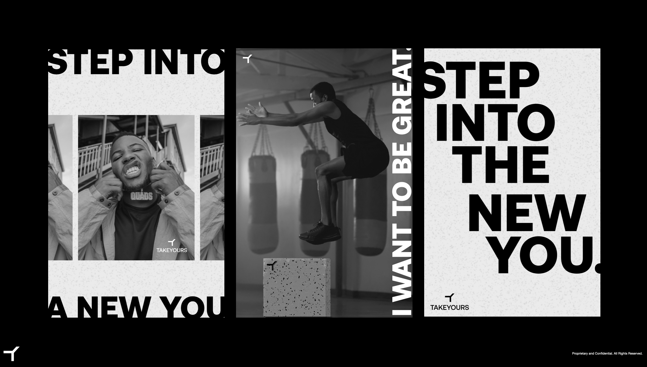
TakeYours is a rallying cry—a mantra. It begins with an idea of feeling like you need to prove yourself, but ends with the knowledge that everything you want, you deserve. It’s a visualization technique, nudging all athletes to not just see their goal, but take it and make it theirs. The name is active with “Take” and personal with “Yours”.
The visual design explores the “beauty in the grit,” a phrase I came up with that helped us capture the essence of the brand. It led us to terrazzo patterns reminiscent of gym training and all the sweat that goes into the moment where you finally take yours. And we landed on a timeless black and white color scheme, filled black and white photography that conjure feelings of nostalgia for gritty training and athletic greatness.
The direction seemed to perfectly encapsulated the essence of Saquon Barkley.
We built the brand.


Complete with a logo that could transform and activate in any scenario, I narrowed down my brand tag lines to ones: Fitness For The Taking


I wrote a brand manifesto, lines of copy for prospective touch points, and worked closely with my visual design partner to further build out the brand’s icons, look, and feel based on our previous insights.


